This is getting way off topic but I get spare time in front of a computer and I like good design so here we are with a post about fonts.
Owners Manual Cover
Here on the front page there are four fonts.YAMAHA- Helvetica Black Condensed
Yamaha's simple logotype is famous the world over and Helvetica is the about a as famous as a font gets. Helvetica Black Condensed is the font variation they used here.
Strings - Faktor Condensed Extra Bold
STRINGS is rendered in Faktor Condensed Extra Bold a font popular with Yamaha at the time. Here it is again on the SK30 brochure.
SS30 - DDT Extended Heavy
SS-30 is printed here in DDT Extended Heavy although it seems to have been made heavier and extended even further than normal.
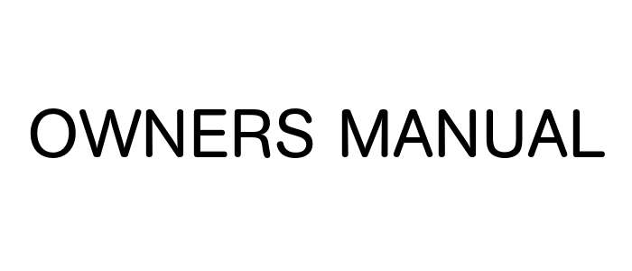
Owners Manual - AG Book Rounded
This is where it starts to get difficult. The previous two fonts have some unique features which make it easier to identify them. and the YAMAHA logotype is so famous you can simply look up the answer (although there are several wrong guesses out there). This one is unremarkable in every way. I was sure that it was Akzidenz-Grotesk Book Rounded , but extended.
AG Book Rounded seems closest though
But that was designed in 1980, which is too late.
There are more fonts that fit the bill almost but not exactly.
Owners Manual Inside
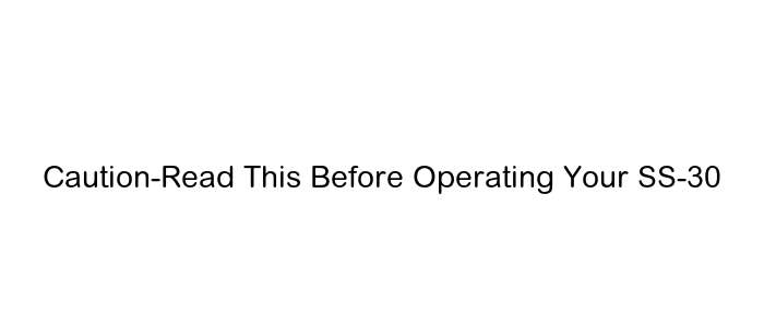
The section headings have a friendly rounded fontThis has lot in common with Arial Rounded.
Except the bottom of the 't' and the top of the 'r' aren't curly enough and the 'O' isn't round it's oval. So, it's not that.
Dynamo
Elsewhere Yamaha were very keen on this Dynamo font from 1930 which shares some features with Faktor.
Mystery 70s Yamaha font
Another font from that era was used for the CP, CS, SK and GS ranges of synths.
Often this font was just used on the owners manual or brochures but sometime it was emblazoned on the synth itself. I can't find what it is though.


